When it comes to analyzing financial markets, traders have a variety of chart types to choose from. Two popular options are tick charts and time charts. Both offer unique advantages and cater to different trading styles. Let’s delve into the differences between tick charts and time charts to help you make an informed decision.
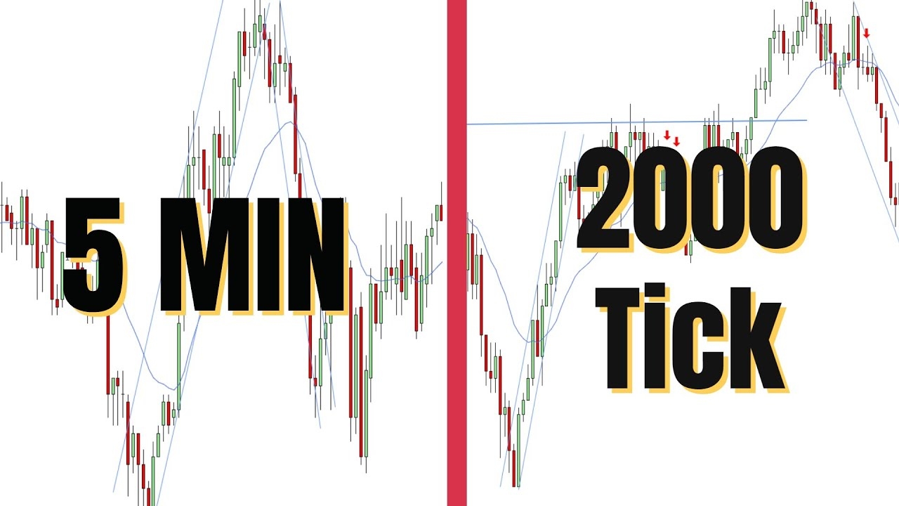
Tick charts plot price movements based on the number of trades executed, rather than time intervals. Each bar on a tick chart represents a specific number of trades, such as 100 or 500. Tick charts are particularly useful for capturing market volatility and providing a clearer picture of price action during high-volume trading periods. Traders who prefer a more granular view of the market often opt for tick charts to identify trends and entry/exit points with precision.

Time Charts: The Traditional Approach
On the other hand, time charts display price movements over fixed time intervals, such as one minute, five minutes, or one hour. Time charts are widely used and offer a broader perspective on price trends and patterns over time. They are valuable for long-term analysis and strategic decision-making. Traders who prioritize longer-term trends and prefer a more structured approach to trading typically rely on time charts for their analysis.
Conclusion: Finding the Right Chart for Your Trading Style
Ultimately, the choice between tick charts and time charts depends on your trading objectives and preferences. If you are a short-term trader looking to capitalize on intraday price movements and volatility, tick charts may be more suitable for your needs. On the other hand, if you are a long-term investor seeking to identify broader trends and make informed decisions over extended periods, time charts may be a better fit.
Experiment with both chart types to see which one aligns best with your trading style and objectives. Remember that there is no one-size-fits-all solution, and it’s essential to choose the chart type that helps you achieve your trading goals effectively.

Download Tick Chart Vs Time Chart


